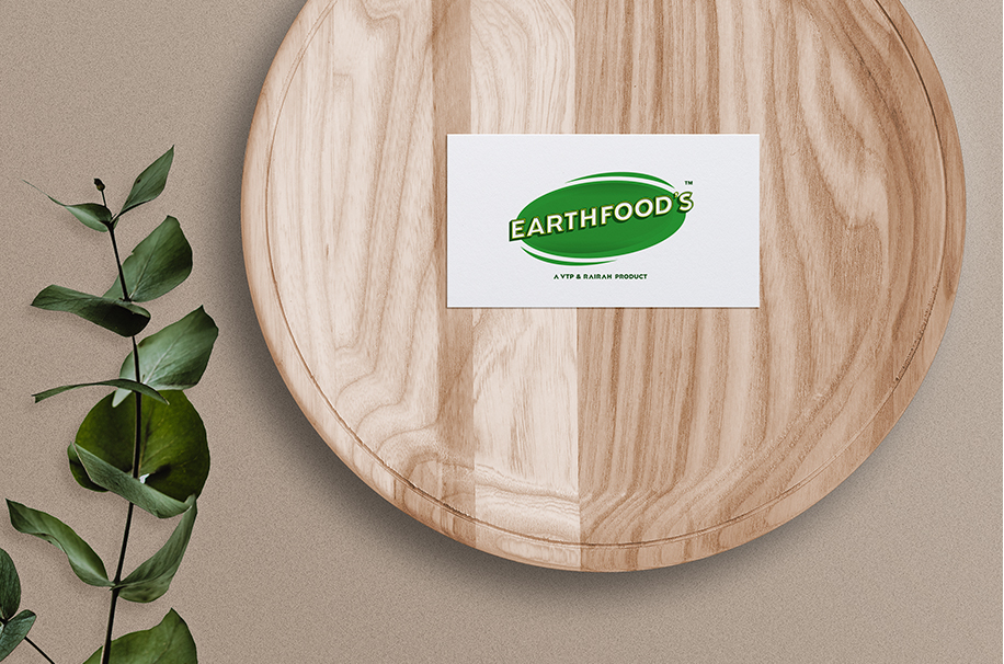
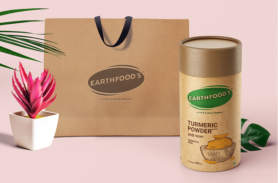
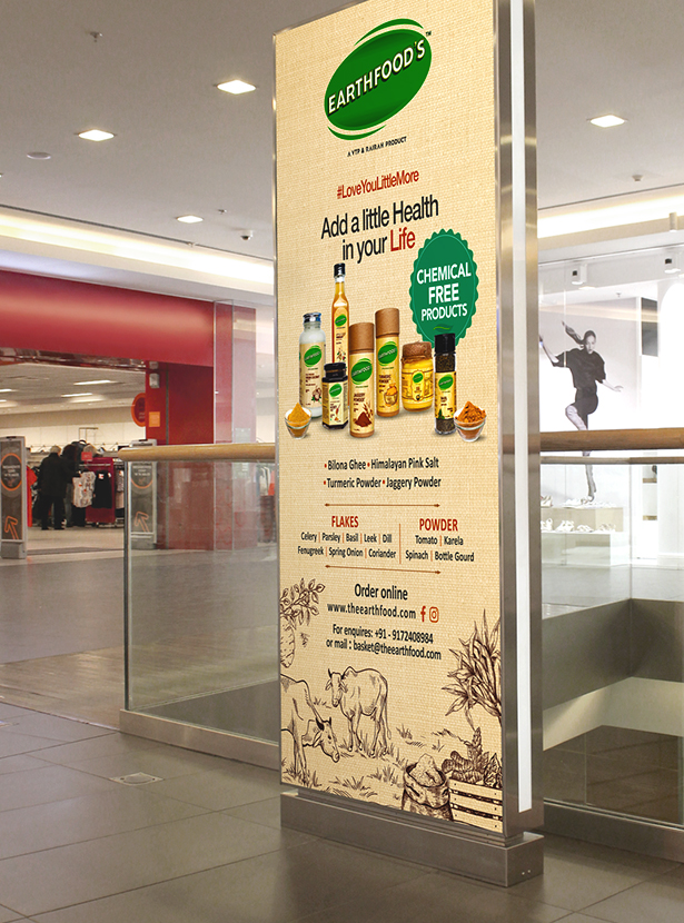
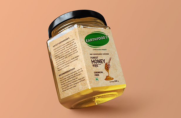
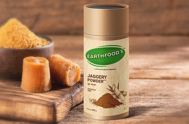
Earthfood’s

When Earthfood’s landed in the Saket’s paradise, the creative challenge took a flight beyond Cloud Nine. Firstly, it was a food industry product, which we all loved to work on, and secondly, it was related to nature. All that Earthfood’s wanted was to recreate their brand image and here’s what we did.

  • Logo Designing
  • Packaging
  • Re-Branding
  • Social Media
UNEARTHING THE BRAND’S
TRUE POTENTIAL

The task was to create a new perception about the brand that caters chemical-free products. The current logo didn’t have the power to attract the right audience. Saket Communications sowed the idea of a New Earth where nature was as abundant and refreshing as our health. And, nature was a universal entity which related to every human being. That’s how the new logo came to life. With groundbreaking (pun, intended) conceptual designs, Saket unearthed the true potential of the brand.

  • ClientEarthfood’s
  • IndustryFOOD
  • ServicesDesign | Content | Art Direction
  • Websitewww.theearthfood.com
EARTHY, WORTHY &
OTHER-WORLDY DESIGN THINKING

While we began to rethink about the brand’s true identity, our ideations birthed from the
very soil the products did. And that’s how we decided to keep
our design thinking grounded deeply into the roots. That’s how we transformed the product packaging
through the earthy essence. The core element of Earthfood’s was the subtlety and that was the
only factor which made the product standout.

Portfolio Images
Portfolio Images

Portfolio Images

We created a New Earth for
your brand's better health