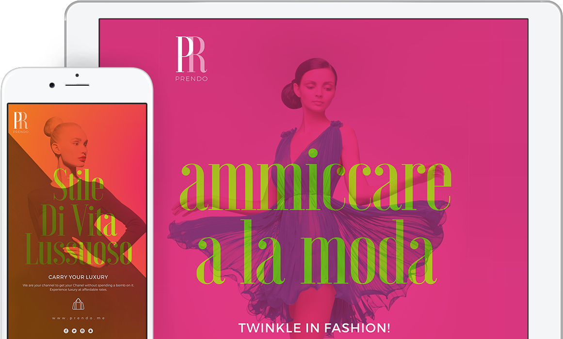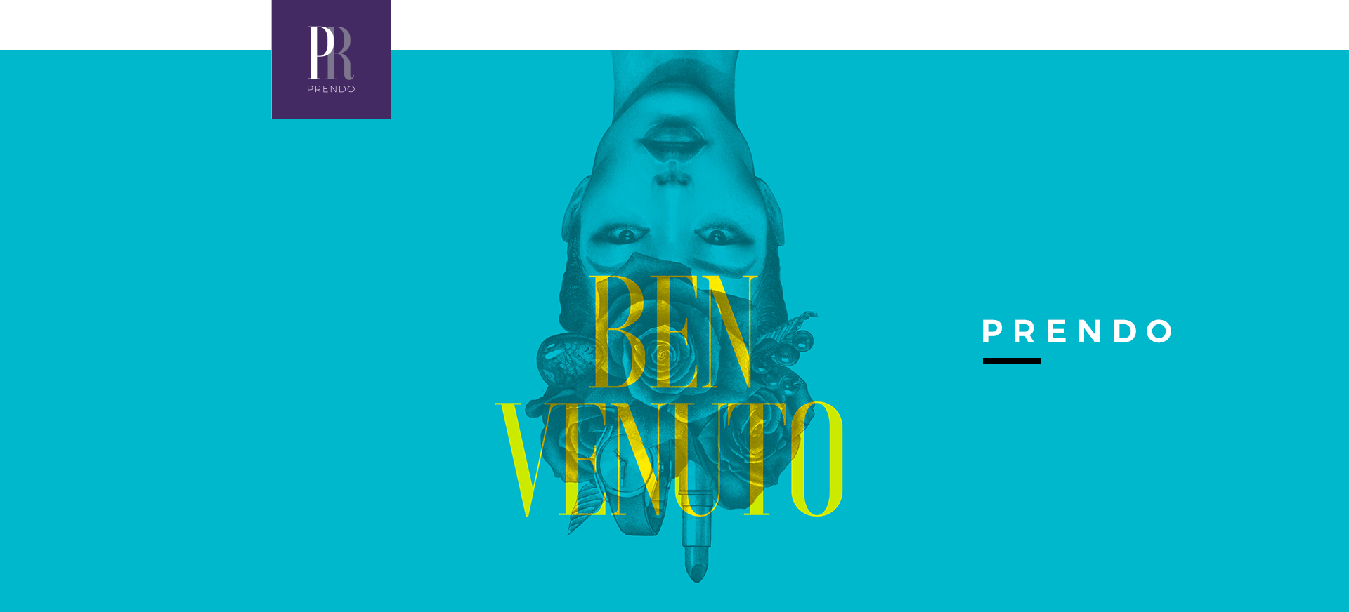
Making a high-end luxury fashion brand land into the homes of the general public was more than just a challenge; it was a Herculean task. Tackling the psychology of price with the “Rent” factor did play well with Prendo and Saket. Communicating this unique concept through their brand colour was a fun assignment. It brought the purple side of fashion out into the wild.
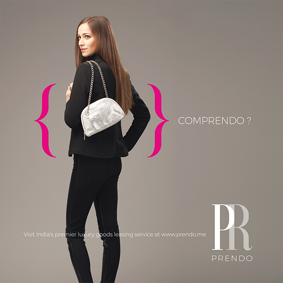

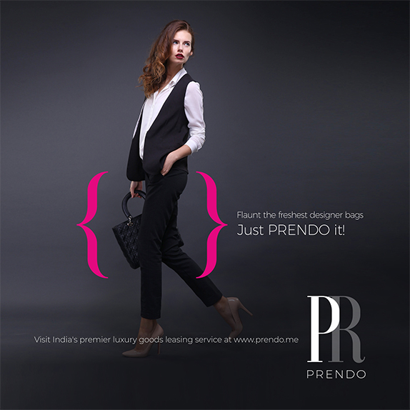
When we started working on the brand, we began to imagine ourselves using the brand. Talk about connecting with the brand! That’s how seriously we took it. We imagined flaunting our bags posing for the Vogue magazine. Prendo had this urge to upgrade themselves socially and rise brand consciousness amongst people. The renting market had such a huge potential when Prendo came in, and that was the advantage we harped on.